Boeing: PMO Visualization Center
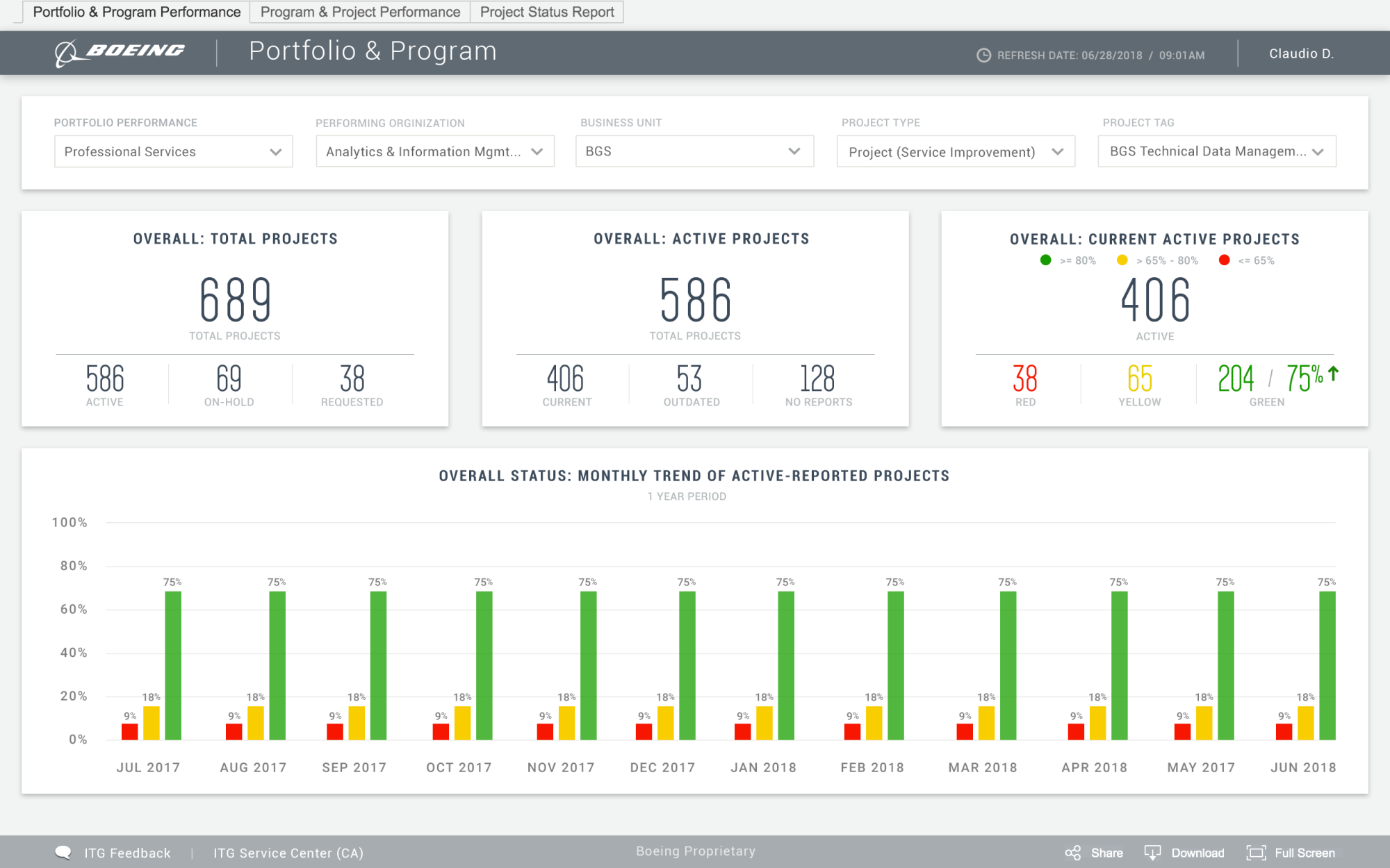
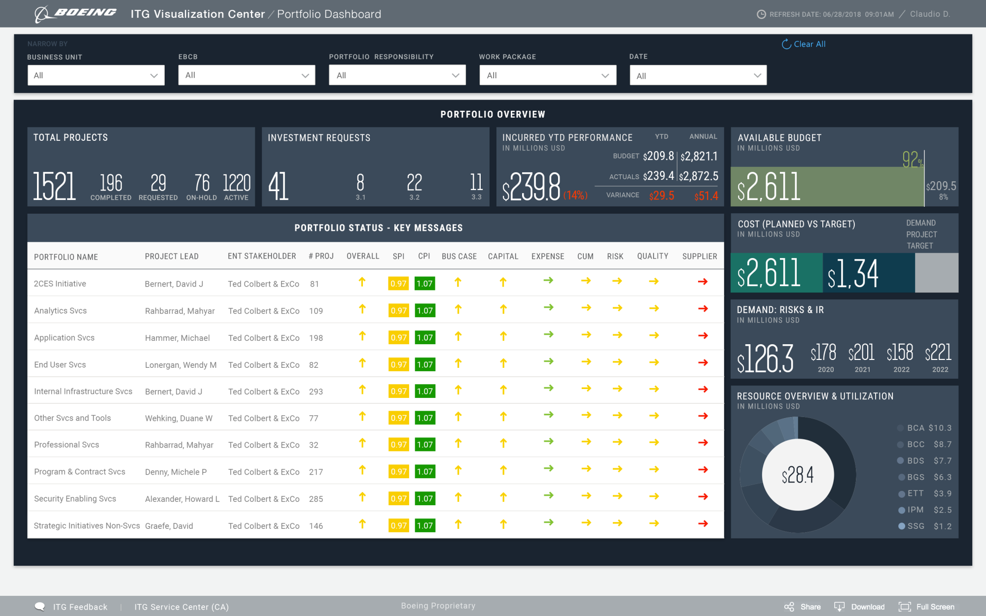
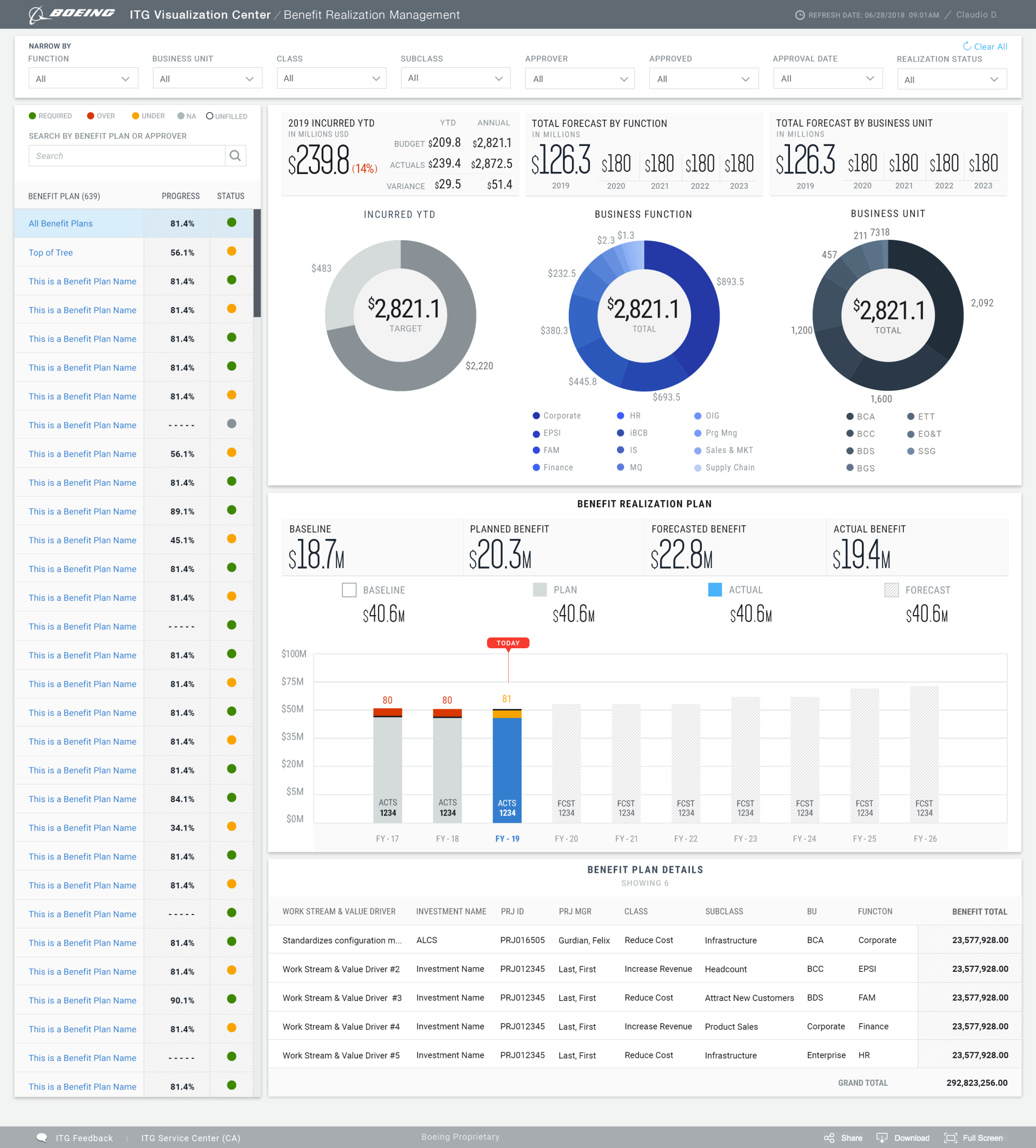
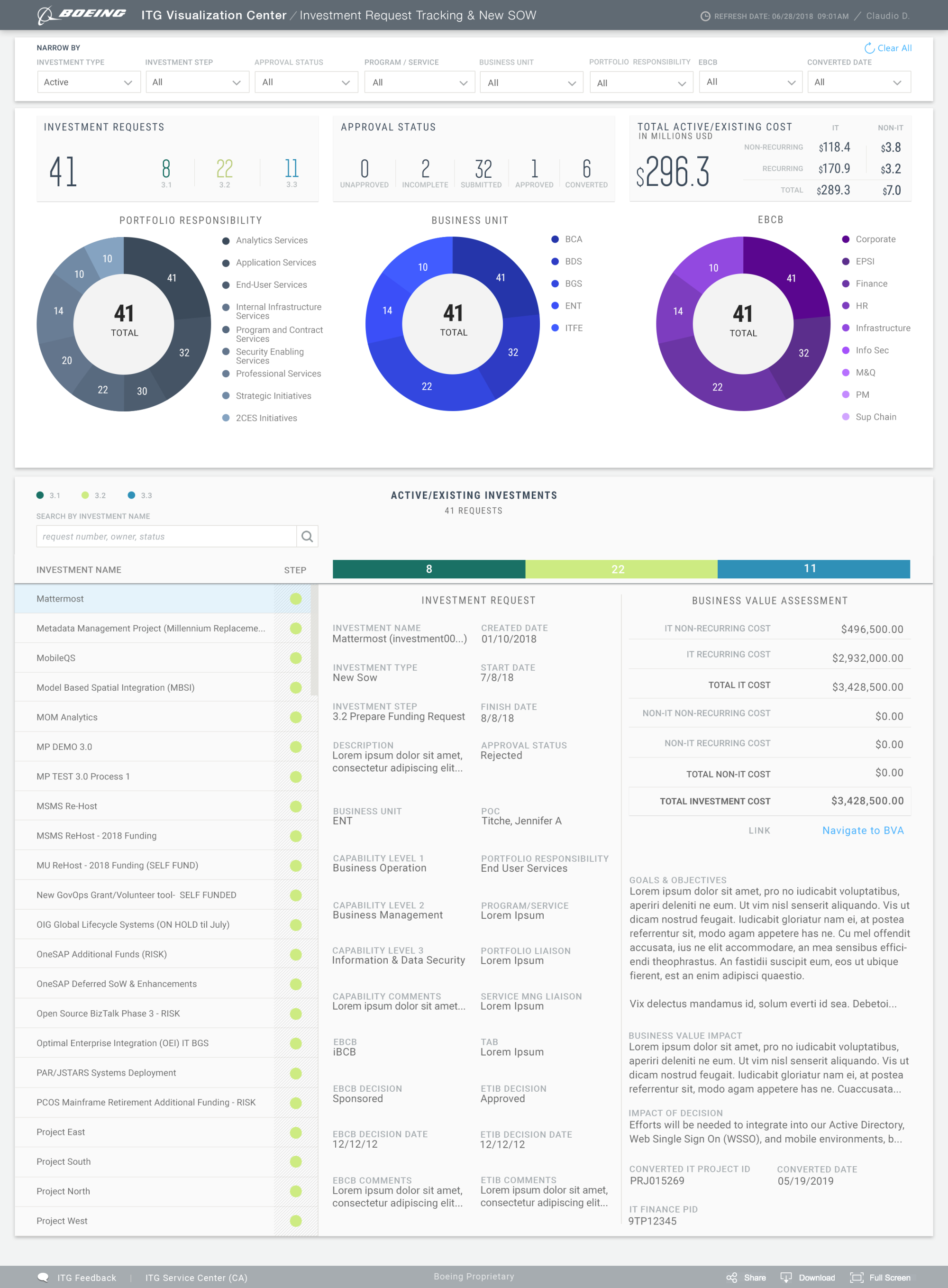
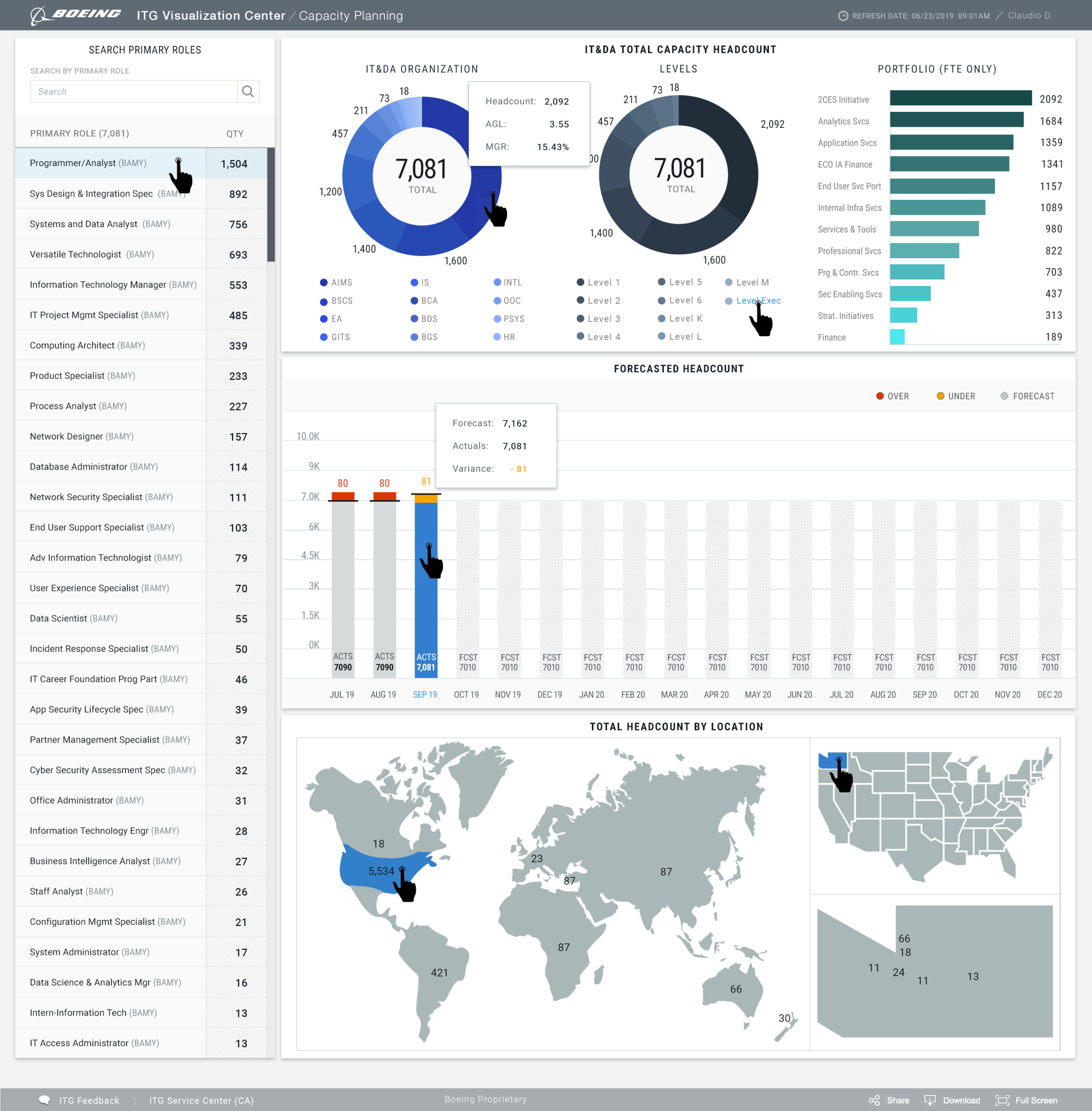
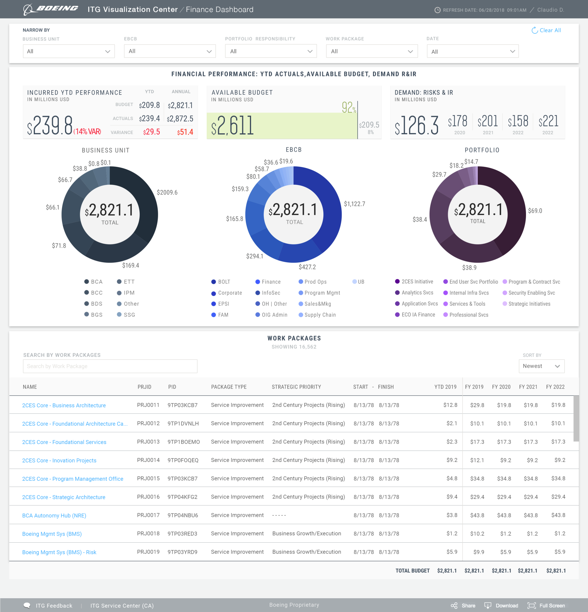
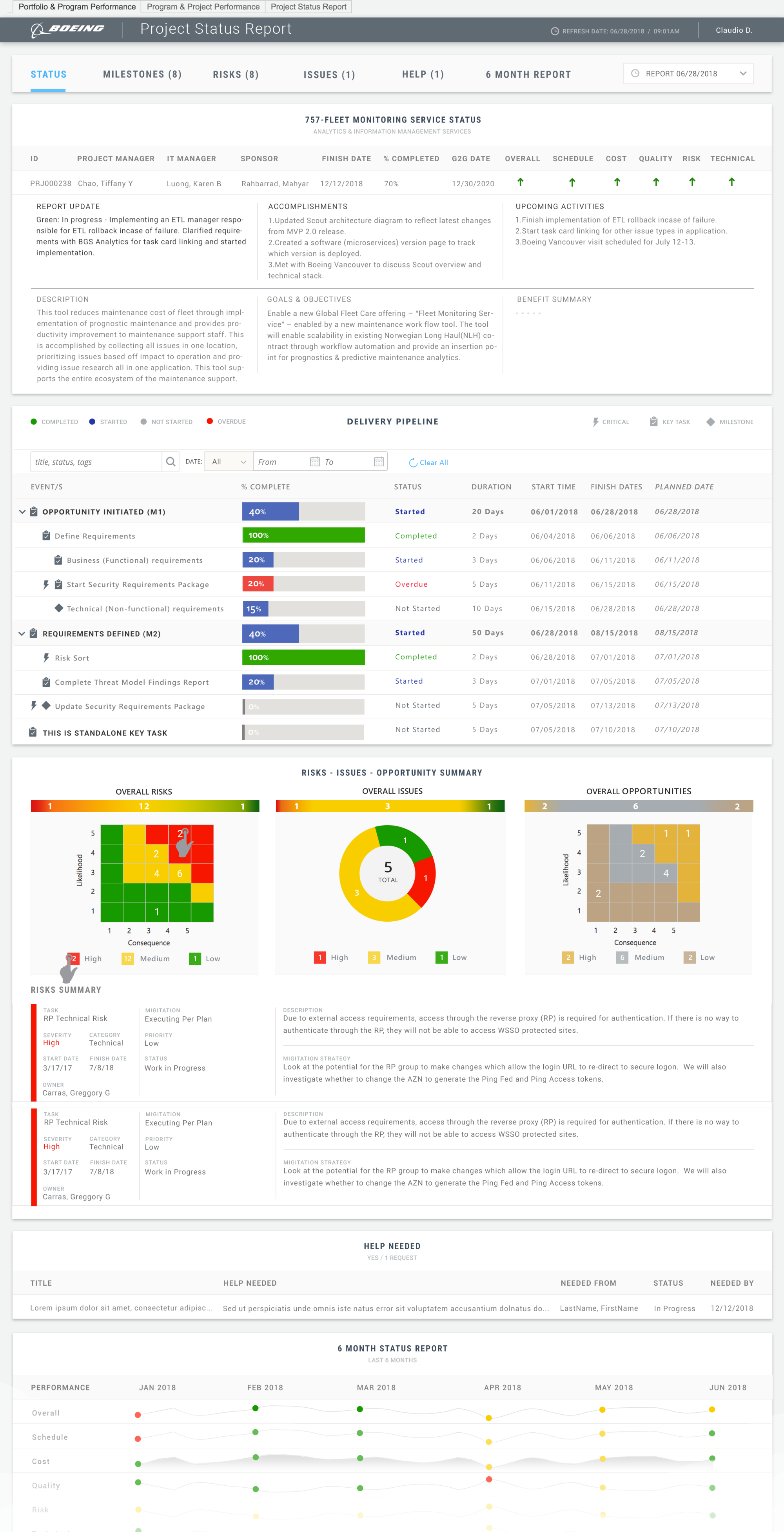
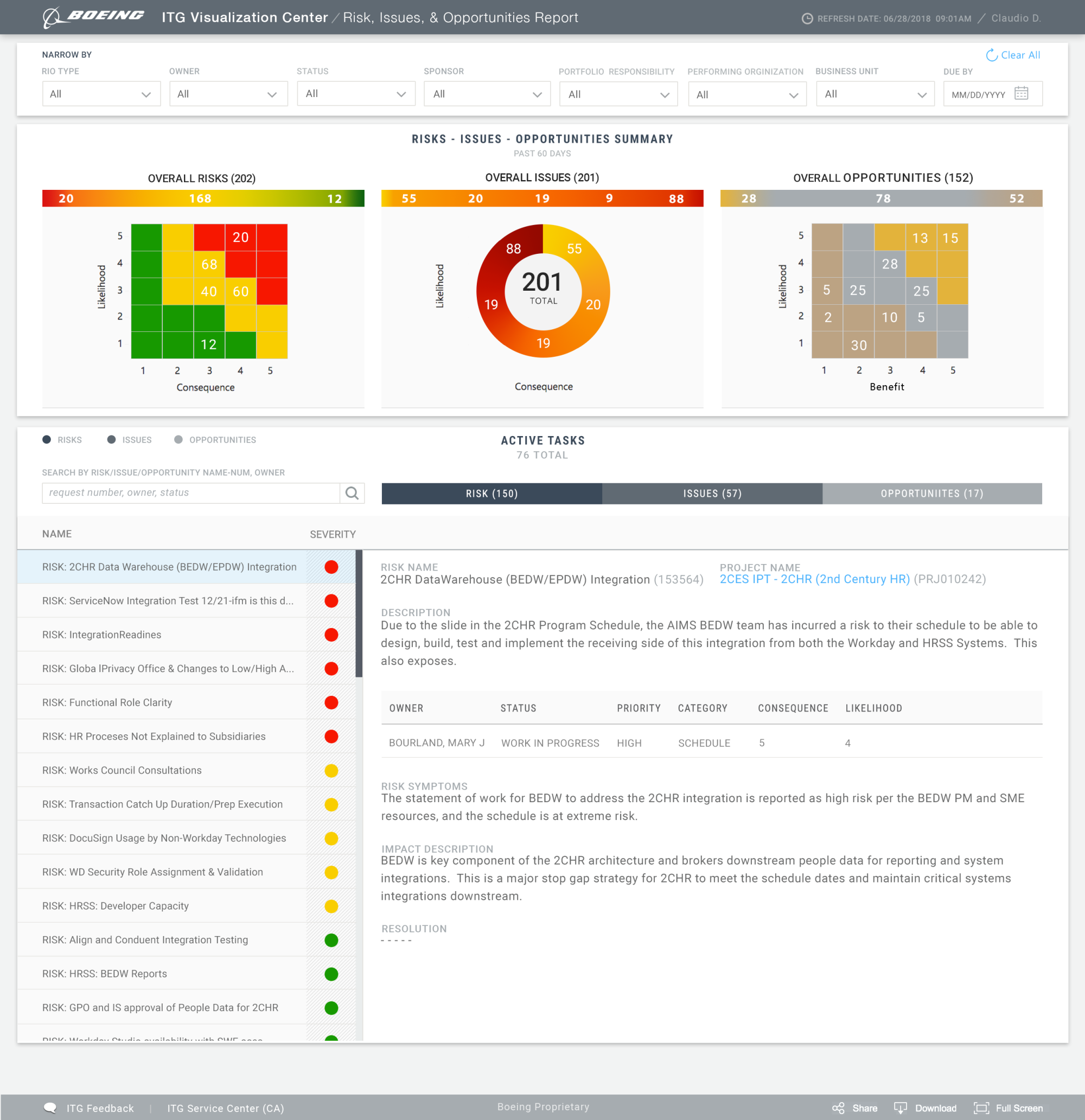
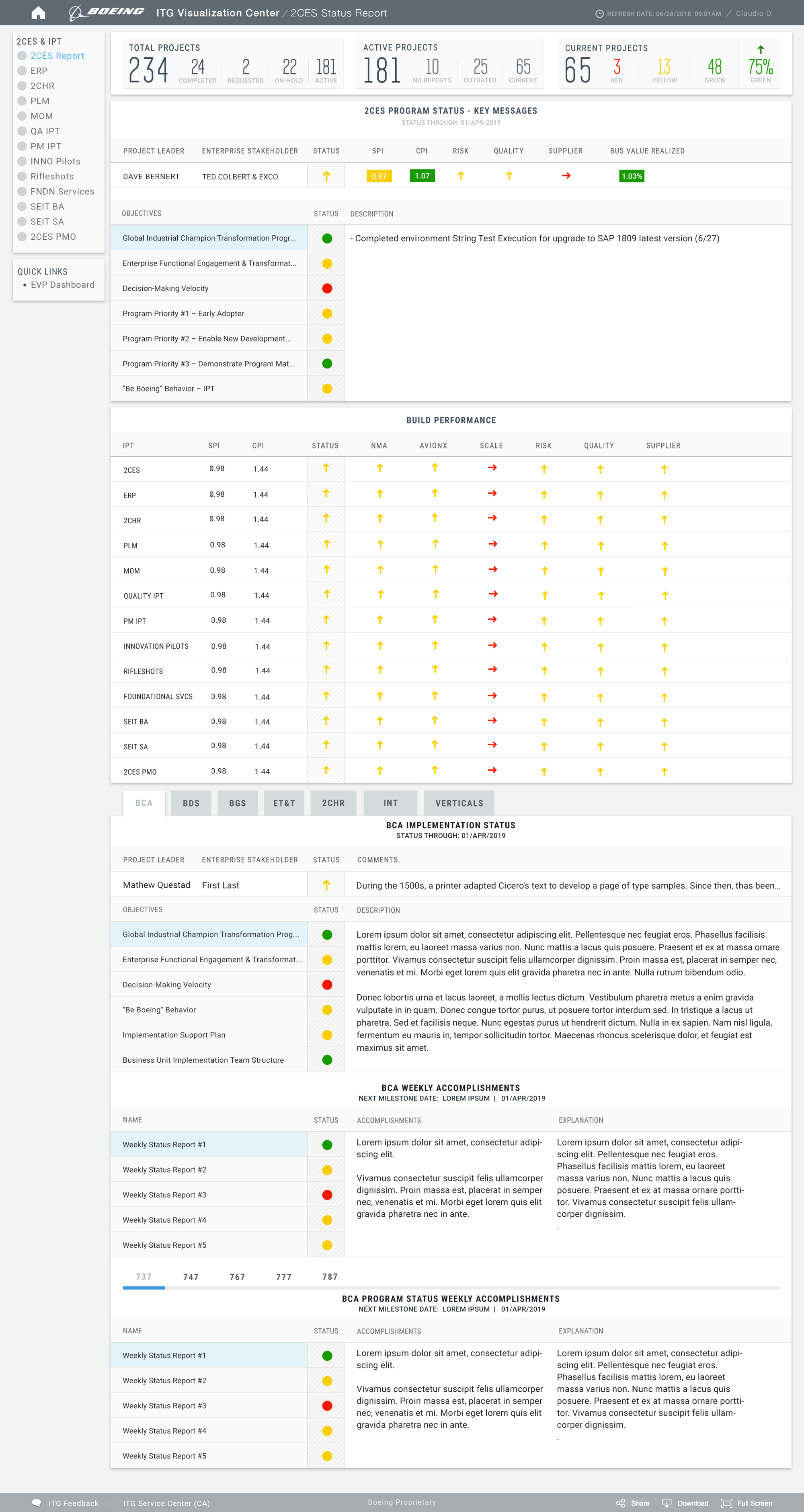
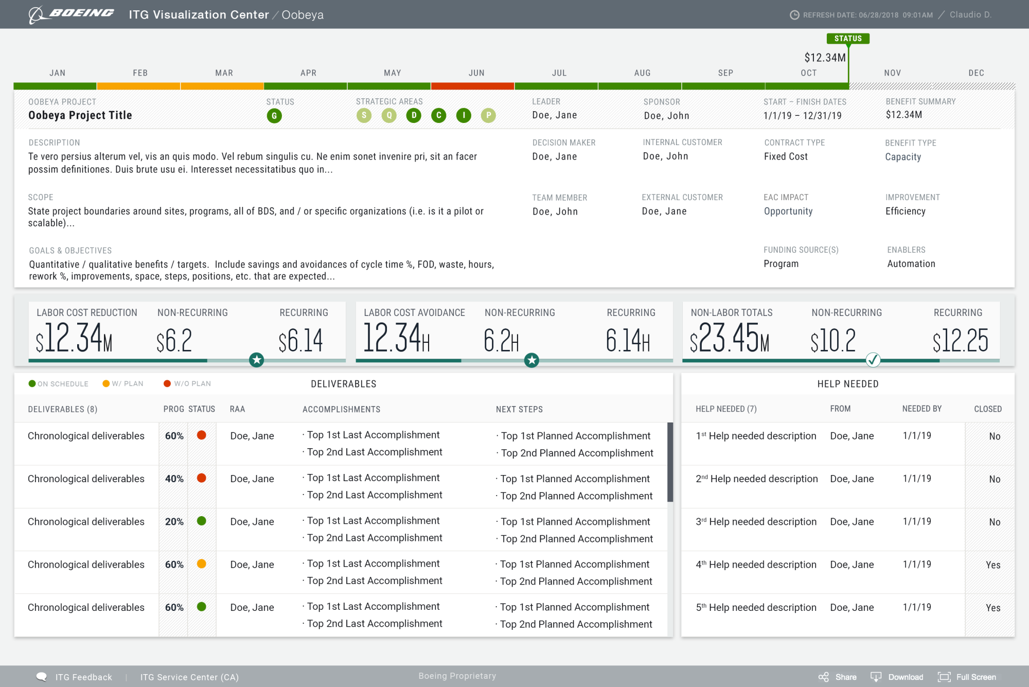
The Boeing PMO dashboard provides comprehensive reports to the Portfolio and Program Managers. The dashboard uses Performance Analytics to provide a trend of historical data as well as regular reports. It gives an overview of investments, ideas, and projects while providing a pipeline view of upcoming intake and a calendar view of upcoming dates.
The Challenge
Boeing's IT department had previously adhered to a static project portfolio management process. The project portfolio was planned once a year and then not adjusted further throughout the year. In addition to the lack of transparency, a major problem was that new topics either had to wait or were done "on the side", and once planned, projects could not be adapted to changing circumstances.
In May 2018, Boeing decided to revise their PPM process. When searching for a new, simple tool for project portfolio management, they decided to seek our design consultation services.
Situation
Boeing has a complex hierarchy within its Enterprise Organizations, Business Units, and Programs across the globe. These areas had not been digitized within one single point of source of data integrity. They were still reporting utilizing Excel, Powerpoint, and Word Documentation once a month. The challenge was to create and design a digital footprint (data warehouse). Creating this narrative would help communicate valuable metrics and share stories across the business and personnel within an hour with live shareable data.
The current issues:
- Lack of context about the reporting sources
- Lack of transparency
- No prioritization or severity levels
- No way of quantifying metrics or KPIs
- No visibility to the leadership teams
- No digital data
Task
- Improve communications between teams
- Managed on-call solutions across multiple work streams via open hours
- Enhanced analytics to identify bottlenecks within mitigating incidents
- Setup operational rules & patterns that would monitor and inform of potential outages
- Report KPIs and Metrics to measure various performances across Business Units
Action
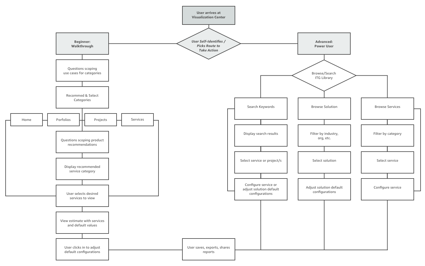
- Digitized Portfolio Management Segments and developed Visual Tableau Dashboards
- Collaborated and coached key Stakeholders and Executives to identify KPIs and Metrics
- Execution of complex interactive prototypes to simulate system interactions, resolutions, and configuration
- User Research, Usability Testing, and Creation of visual metaphors and conceptual frameworks
- Worked towards a new visualization language and data design patterns
Results
I suggested prioritizing one of the customer segments and building a User flow that suited those customers first, releasing new meaningful Journeys for the rest of the segments in cycles afterward. It helped launch the product faster and avoid high development costs… Finding a simple solution is what design is all about…
Tools
- Sketch (Wireframes & Visual Design)
- InVision (Prototype)
- Photoshop (Visual Design)
- Tableau